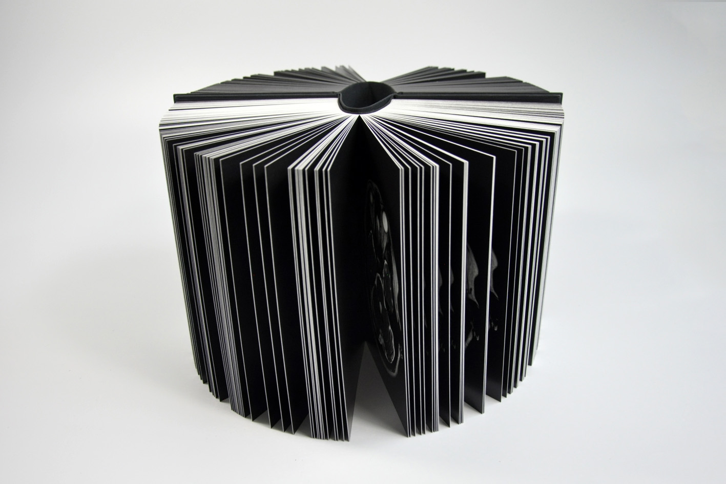
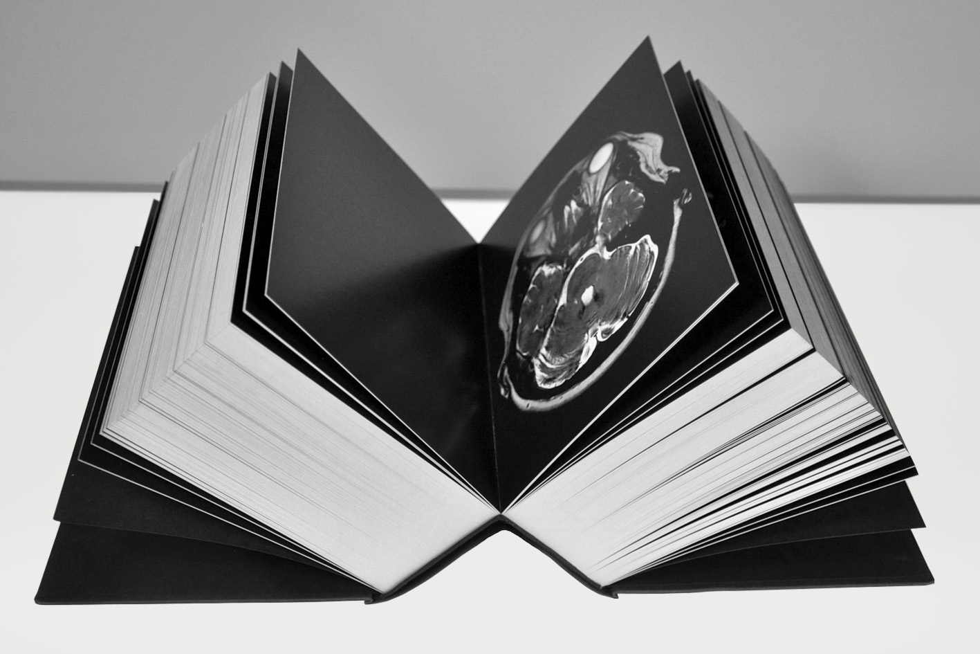
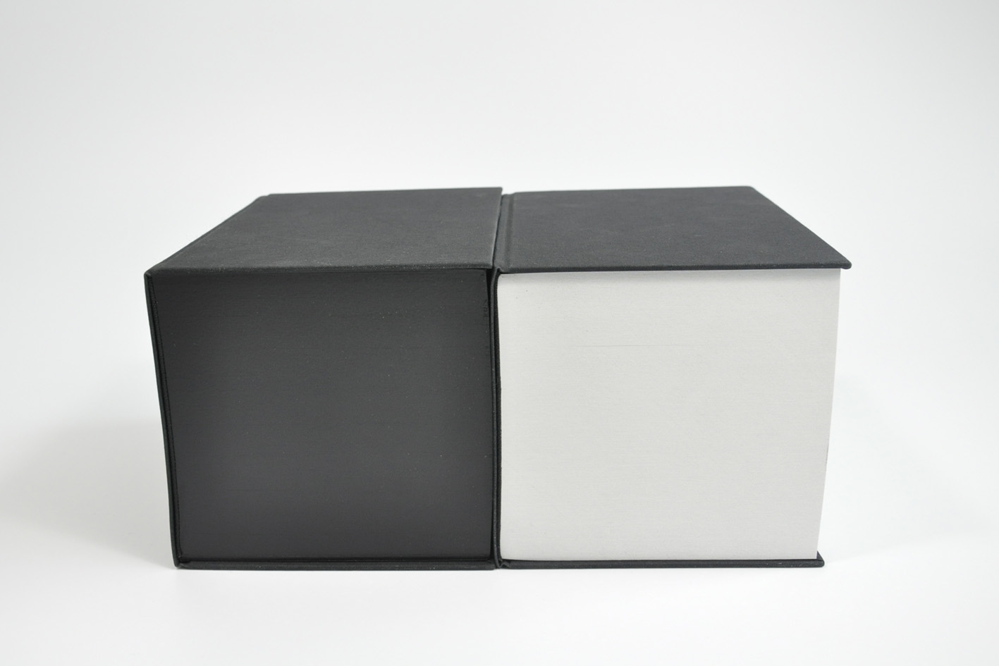
Vanitas (white and black versions), 2018.
14 x 20 x 14 cm, 660 pages.
Printed and bound in The Netherlands.
—
vanitas-book.com
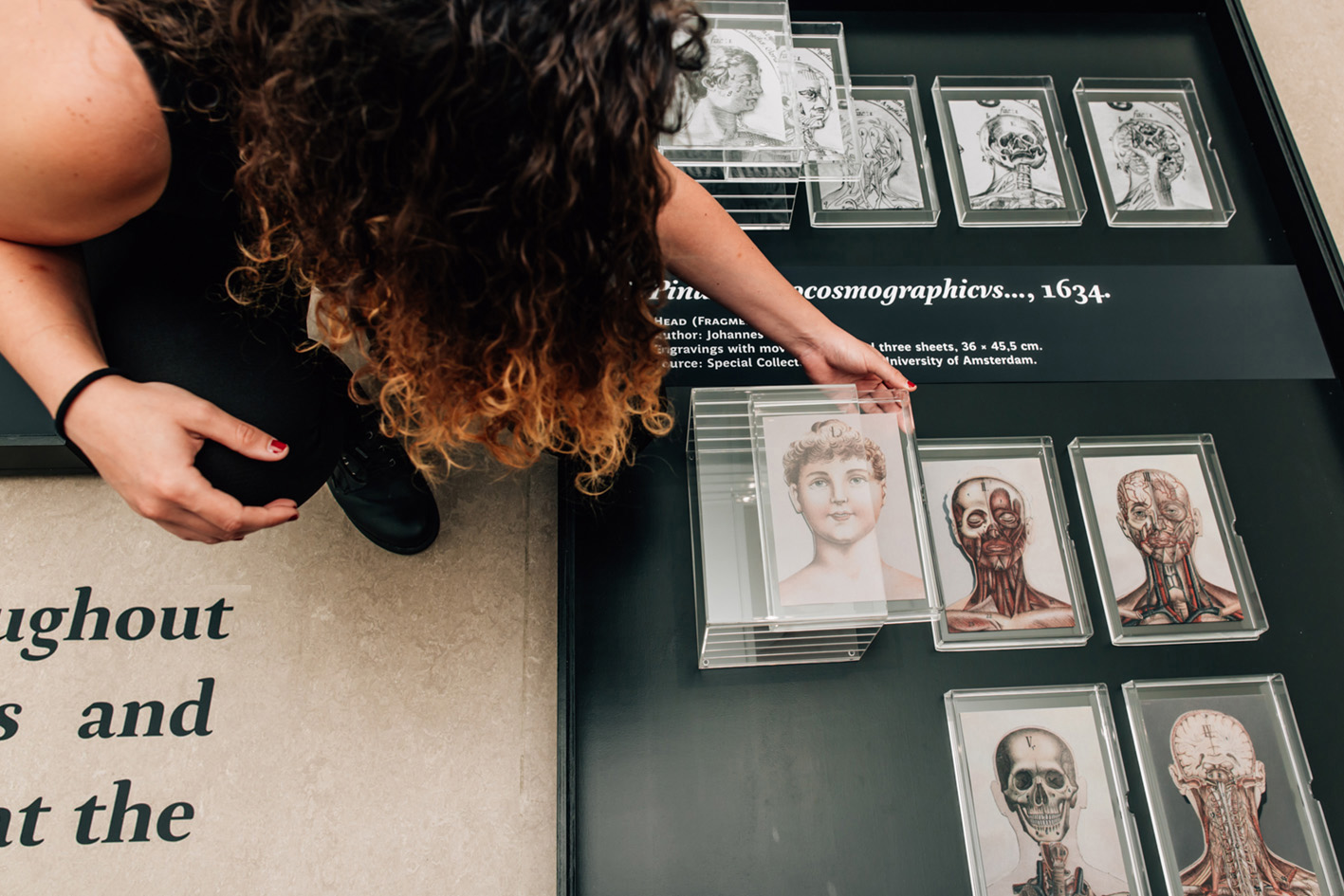
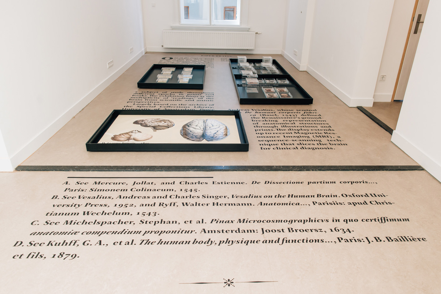
PAPER BRAINS was an interactive exhibition curated by Danne Ojeda in collaboration with Lisa Kuitert (Book and Manuscript Studies) and the Special Collections Library, University of Amsterdam.
—
Dates
22.06–17.07.2017
—
Place
Book & Manuscript Studies
Turfdraagsterpad 15–17, 1012 XT
Amsterdam, University of Amsterdam (UvA)
THE NETHERLANDS
—
Photo credits: Stefanie Archer
1. Aletta H. Jacobs. De Vrouw. 1898 (Fragment).
2. General view of the exhibition.
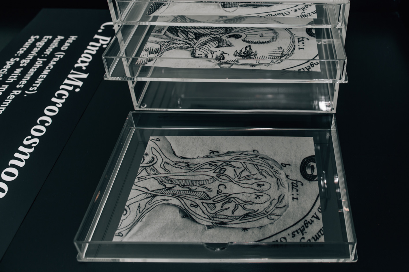
3. Johannes Remmelinus. Pinax Microcosmographicus..., 1634 (Fragments).
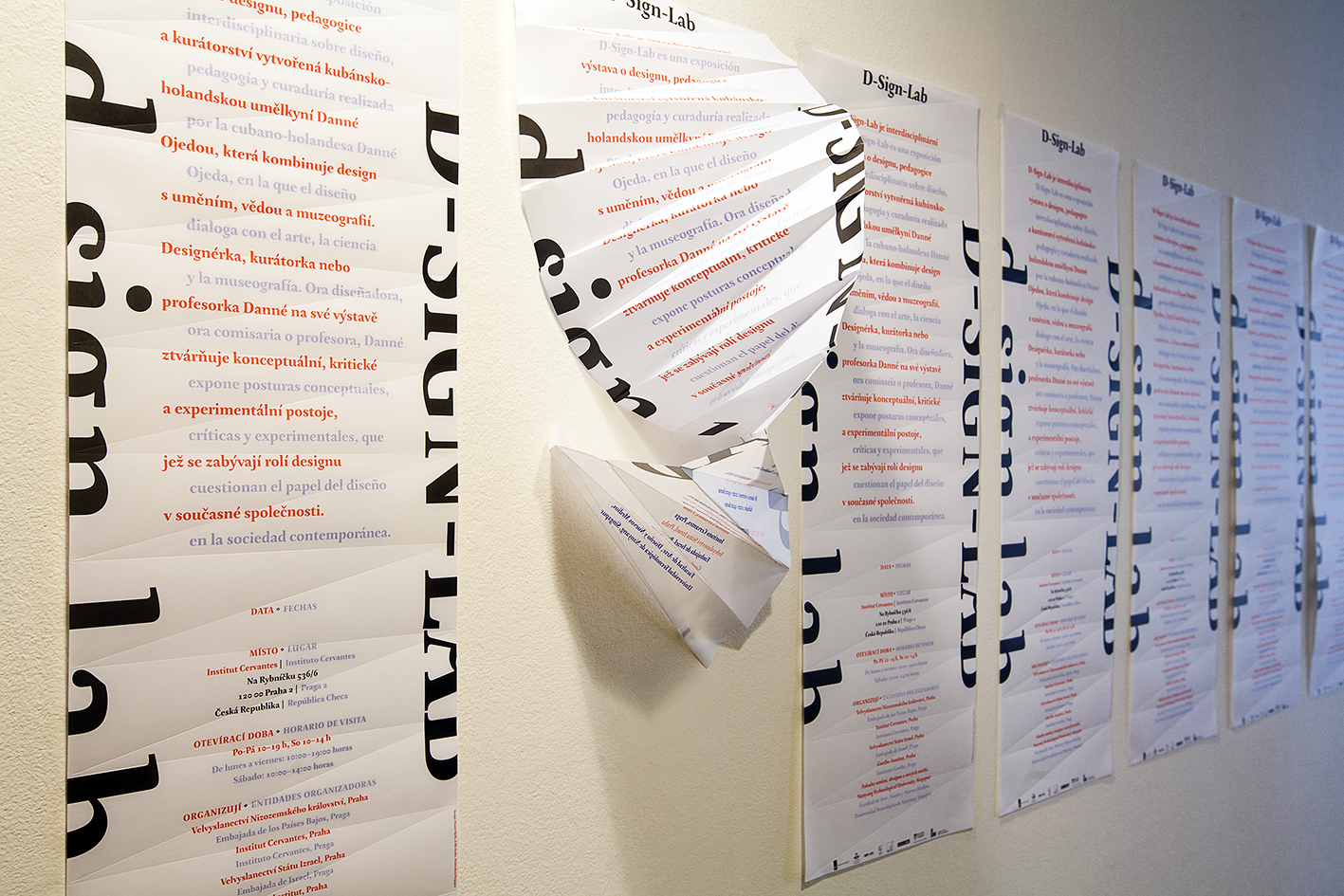
D-SIGN-LAB was an interdisciplinary solo exhibition on design, pedagogy and curatorial works by Danne Ojeda, in which design dialogued with art, science and museology, among other fields. Whether as a designer, a curator or an educator, Danne exposed experimental, conceptual, and critical positions that question the role of design in contemporary society.
—
Dates
03.12.2015–30.01.2016
—
Place
Cervantes Institute
536/6 Na Rybnícku
120 00 Prague 2 Prague
CZECH REPUBLIC
—
More on the show → Interview with Danne Ojeda
—
Photo credits: Kryštof Blaek
D-SIGN-LAB was an exhibition within the context of de.sign series.
de.sign series is a graphic design lecture and exhibition event organized by four European cultural institutes and embassies in Prague – Goethe Institut, Instituto Cervantes, Netherlands Embassy in Prague and Embassy of the State of Israel.
The main goal of the project is to introduce to Czech audience designers from the Netherlands, Spain, Germany and Israel.
Supported by
Embassy of the Netherlands, Prague
Cervantes Institute, Prague
Israeli Embassy, Prague
Goethe Institute, Prague
Edition Lidu Book Publishers
School of Art, Design and Media,
Nanyang Technological University, Singapore
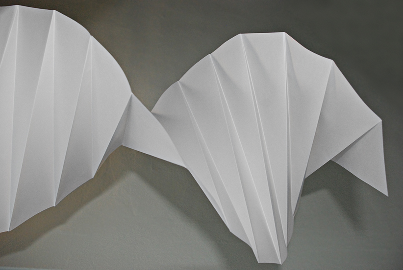
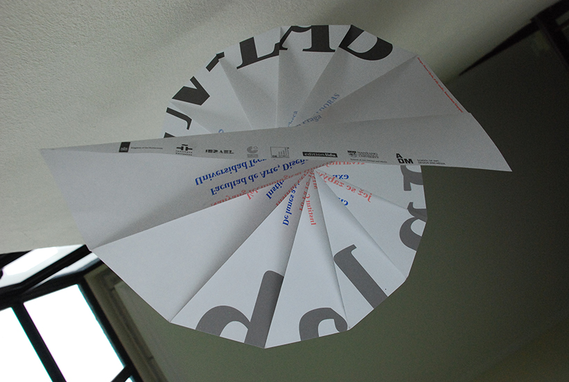
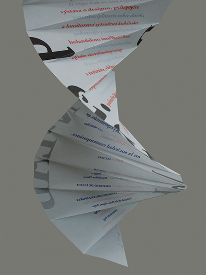
DNA origami poster (D-Sign-Lab exhibition poster)
—
Images: DNA, D-Sign-Lab poster prototype and final posters
—
Design:
Danne Ojeda
—
Supported by:
Embassy of the Netherlands, Prague
Cervantes Institute, Prague
Israeli Embassy, Prague
Goethe Institute, Prague
Edition Lidu Book Publishers
School of Art, Design and Media,
Nanyang Technological University, Singapore
The poster resembles the structure of a DNA in paper origami as it promotes the core design elements of the exhibition D-Sign-Lab which refers to a relation between art, design and science.
Translucent paper was selected not only to sustain the folded DNA origami structure, but also to be able to read the bilingual texts—Spanish and Czech at once but also apart from each other.
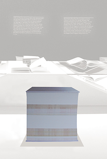
BstOOlK
—
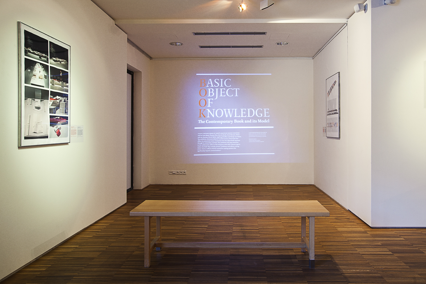
Book-model after the book-stools of the installation Basic Object Of Knowledge (B.O.O.K.): The Contemporary Book and
its Model
—
Design:
Danne Ojeda
Photos: Marvin Tan and d-file studio
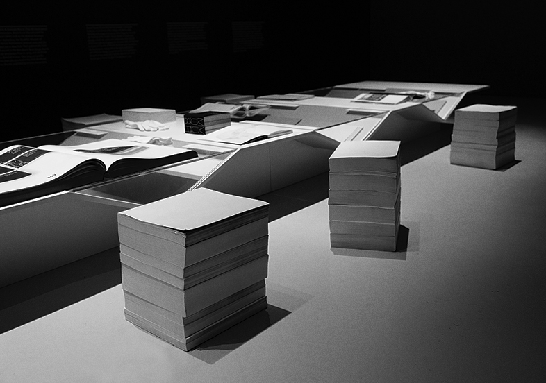
Basic Object Of Knowledge (B.O.O.K.): The Contemporary Book and
its Model
—
An exhibition-installation curated by Danne Ojeda at the Centre for Contemporary Art Singapore, CCA, Singapore.
13–16.11.2014
—
Curator: Danne Ojeda
Exhibition design: Danne Ojeda and Outofstock
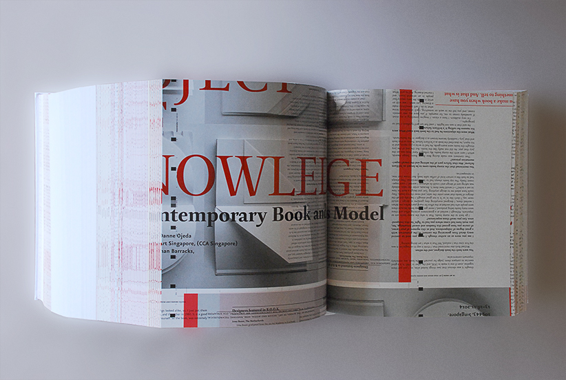
BstOOlK
—
Design:
Danne Ojeda
English texts
1900 pp, 27.5 x 24 x 28.5 cm
Edited and bound in Singapore
Full color illustrations
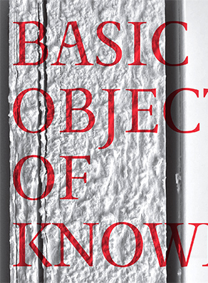
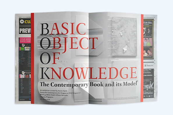
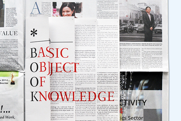
* [Asterisk] B.O.O.K. is a newspaper supplement - catalogue published on the occasion of the exhibition B.O.O.K. Basic Object of Knowledge. The Contemporary Book
and its Model, held at the Centre for Contemporary Art Singapore,
CCA, (13–16.11.2014).
—
Edited and published by: Centre for Contemporary Art Singapore, CCA, and the School of Art, Design and Media, ADM, Nanyang Technological University, NTU, Singapore.
Design:
Danné Ojeda
* B.O.O.K. was conceived in a form of a newspaper supplement and designed as an insert for The Straits Times and the Today’s newspapers in Singapore.
Previous editions of * [Asterisk] can be seen here
1. * B.O.O.K.. Detail.
—
2. * B.O.O.K. as an insert for Today newspaper. Middle spread with poster for the exhibition B.O.O.K.
—
3. Detail of * B.O.O.K. as an insert for The Strait Times newspaper.
20.07.2013–27.04.2014
—
ASIA’S TOP DESIGNERS AWARD,
SINGAPORE DESIGN AWARD 2014
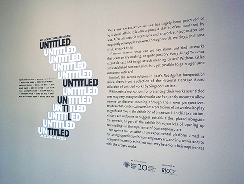
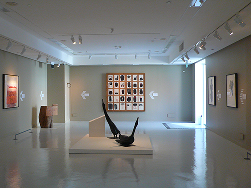
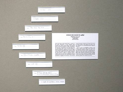
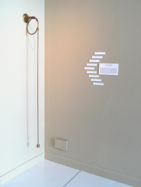
The exhibition Not Against Interpretation: Untitled took place at the Singapore Art Museum, Singapore. The exhibition presents untitled artworks by local artists. One of the main purposes of the curator Michelle Ho is to motivate the audience to title the artworks that are on display in the gallery space.
The arrow structure that is beside the artworks holds the different titles that the audience gives to the exhibited untitled artworks. This arrow structure also relates to the poster UNTITLED UNTIL TITLED (to be found below) designed for this exhibition. Blank labels are to be torn off from the poster’s line-shaft of the arrow, in order to be inserted in the arrow’s broad head structure beside the artworks in the gallery.
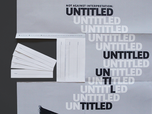
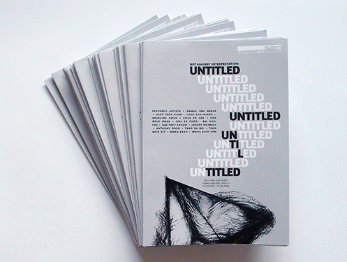
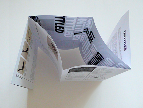
Poster–brochure UNTITLED UNTIL TITLED for the exhibition Not Against Interpretation: Untitled, Singapore Art Museum (SAM), Singapore.
20.07.2013–27.04.2014
—
Design: Danné Ojeda
—
ASIA’S TOP DESIGNERS AWARD
SINGAPORE DESIGN AWARD 2014
The poster is at once an A2 poster of the show UNTITLED, and an educative guide/brochure that will help the audience in giving titles to the artworks in the gallery. It reinforces the action to be undertaken by the audience. In that respect, the message UNTITLED UNTIL TITLED appears as a form of an arrow broad head. The line-shaft of the arrow is represented by a series of blank labels to be torn off that the audience will use to give titles to the artworks in the gallery.
ASIA’S TOP DESIGNERS AWARD,
SINGAPORE DESIGN AWARD 2014
—
GOLD AWARD, SINGAPORE DESIGN AWARDS 2012
—
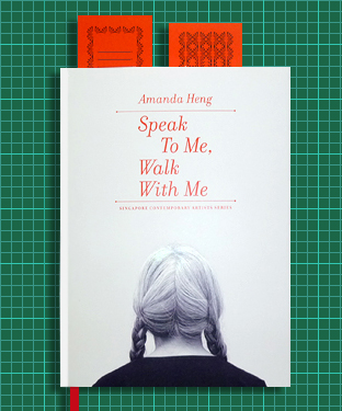
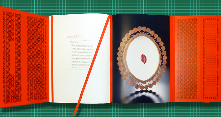
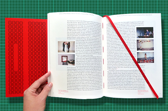
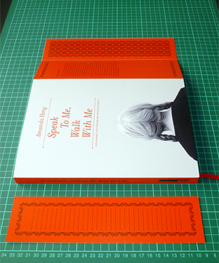
AMANDA HENG: SPEAK TO ME, WALK WITH ME
Singapore Art Museum (SAM), Singapore
—
Edited by: Singapore Art Museum, Singapore
Editorial design: Danné Ojeda
—
English, Chinese and Japanese texts
228 pp, 18 x 25 cm
Full color illustrations
ISBN 978-981-07-0087-4
ASIA’S TOP DESIGNERS AWARD,
SINGAPORE DESIGN AWARD 2014
—
SPARK! AWARD 2014, NEW YORK, USA
—
BEST ART CATALOGUE, ART BOOK WANTED INTERNATIONAL AWARD, CZ, 2013
—
RED DOT DESIGN AWARD WINNER,
COMMUNICATION DESIGN, GERMANY, 2010
—
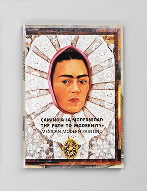
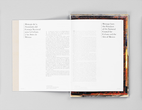
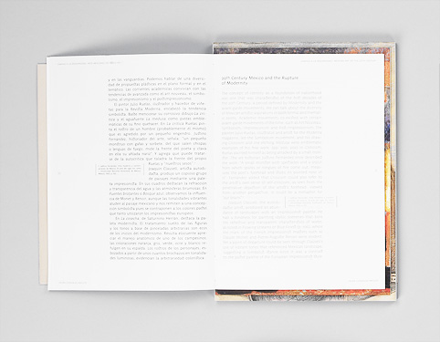
Edited by: Singapore Art Museum, Singapore and the National Institute of Fine Arts, Mexico, 2009
Editorial design: Danné Ojeda
—
English and Spanish texts
216 pp, 17.6 x 25 cm
Full color illustrations
ISBN 978–981–08–4221
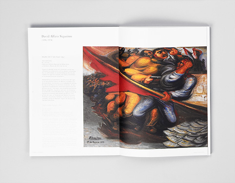
This catalogue focuses on the topics of painting and portraiture, and takes its inspiration from the modern maxim of installing ‘new possible ways of re-presentation’. The raw quality of the catalogue is inspired by the anti-normative tradition of painting that characterizes Mexican open-air painting schools. These schools were meant for the masses and were characterized by a spirit of experimentation. They rejected the academic prescribed manners of representing reality.
The catalogue has four sections of different sizes. This structure produces a sculptural effect that resembles a pyramid. Inspired by ceremonial Mesoamerican pyramids, such a structure was chosen as an allegory of the eternal cycle of the human/divine creation that Mexican culture has been engaged with since the pre-Columbian until modern times. The structure of the catalogue also appears as a canvas mounted on a three-dimensional frame. This effect continues inside the book, as the pages seem to come out of a pictorial frame. Words play as colours, letters and drop caps stand up as pure lines. The book and its pages perform a series of paintings.
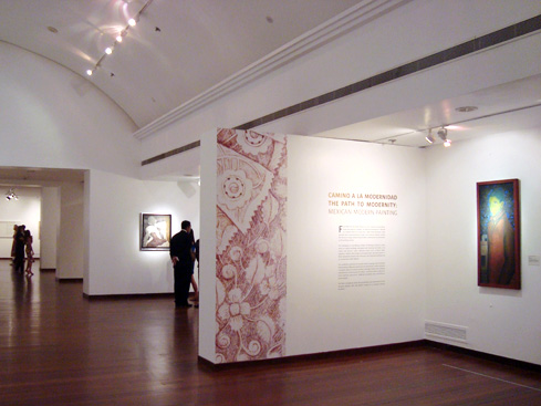
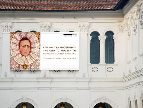
MEXICAN MODERN PAINTING, Singapore Art Museum (SAM),
Singapore
—
Exhibition design: Danné Ojeda
homonym curatorial project
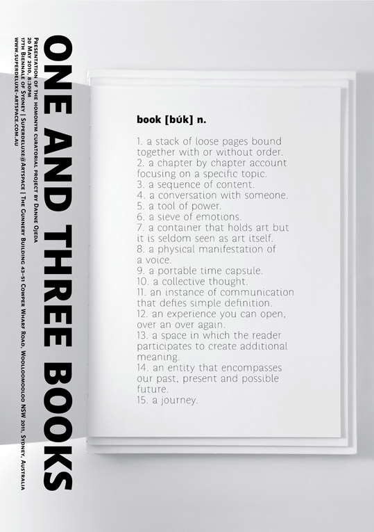
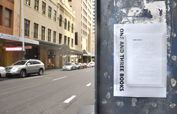
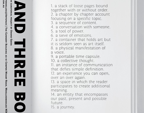
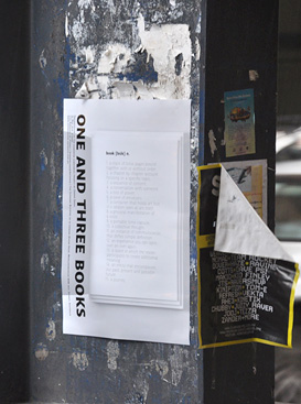
ONE AND THREE BOOKS by Danne Ojeda
—
20 May 2010, 8:30pm
17th Biennale of Sydney,
Superdeluxe@Artspace
The Gunnery Building 43–51
Cowper Wharf Road,
Woolloomooloo NSW 2011,
Sydney, Australia.
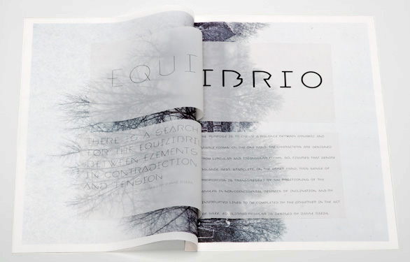
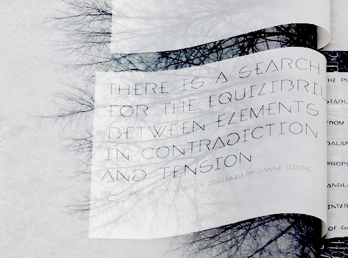
The purpose was to create a balance between dynamic and stable forms. On the one hand, the characters were designed from circular and triangular forms, so, figures that denote balance, rest, stability, On the other hand, this sense of proportion is transgressed by the positioning of the angles in non-coincidental degrees of inclination, and by interrupted lines to be completed by the observer in the act of gaze.
—
Exhibited at the 4th Latin-American
Design Forum 2009, Buenos Aires Argentina
—
Download pdf (804KB)
card series
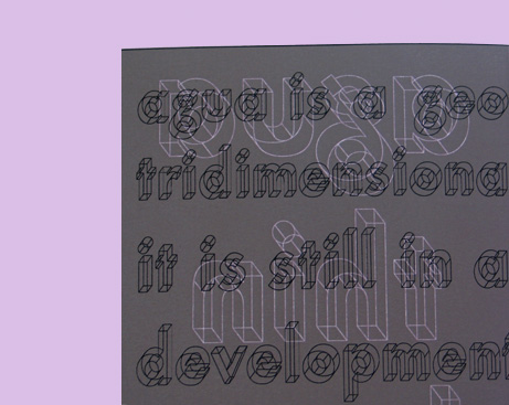
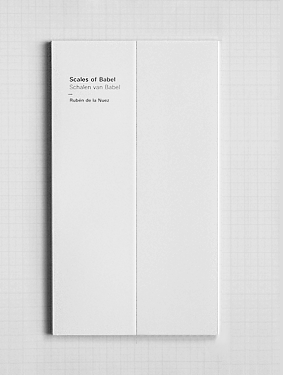
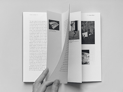
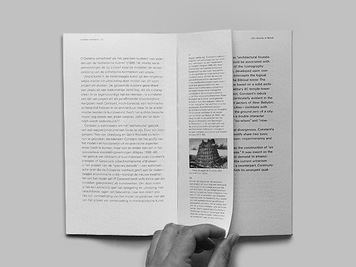
Author: Rubén de la Nuez
Editorial design: Danné Ojeda
—
English and Dutch Texts
Bimaris, Amsterdam, 2005
92 pp, 12 x 21 cm,
b/w illustrations
ISBN 90-809840-1-9
—
Exhibited at the 4th Latin-American
Design Forum 2009, Buenos Aires Argentina
—
Download pdf (184KB)
   |
Photography:
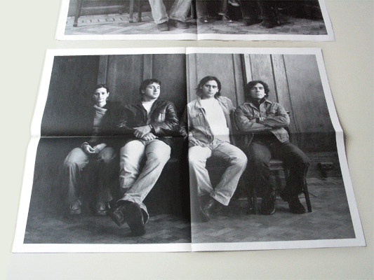
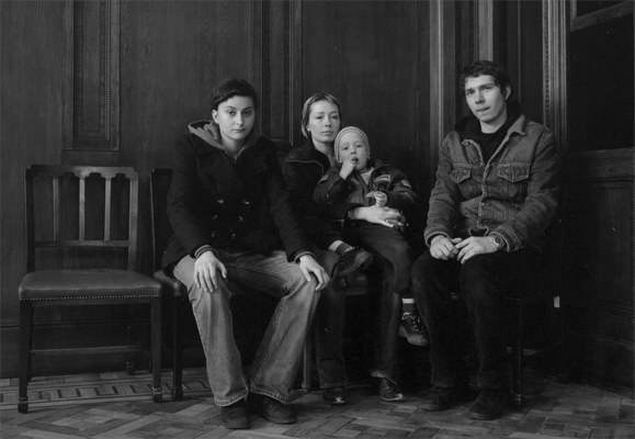
| The ‘Koninklijke Hollandsche Lloyd’ was
established as an emigrant hotel in 1921. Until 1935 this ‘passing
by’ scenario hosted numerous families or individuals that were
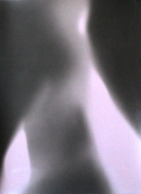
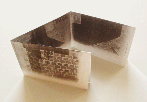
determined to go overseas looking forward to a better way of life. Our teamwork was moved by the fact that the actual Lloyd Hotel inhabits different sociocultural pasts. Therefore, we settled a project, which focused on a relationship between the actual environment and the past of the hotel. The room number 28 was our scenario to portrait group of people that will somehow establish a suggestive presence on the historical chosen environment like if they would belong to another époque and yet to the present one, preserving a ubiquitous feeling. | The pictures taken at the Lloyd Hotel,
where later appeared in a folder that I edited and designed. |
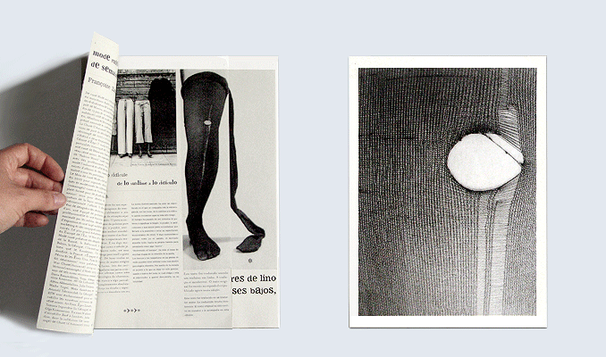 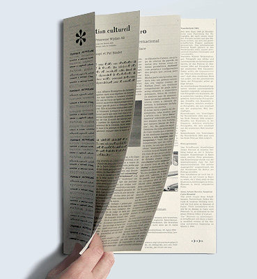  |
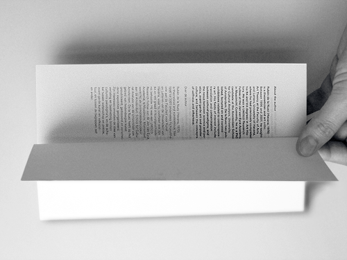
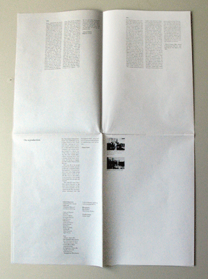
* (Asterisk) is a cultural
supplement initially conceived for the newspaper ‘El País’,
in order to provide cultural news in different languages. The design
is based on the possibility of ‘unfolding the grid’ of a newspaper. Hence, each column reveals a page. | * N. 2: Fashion and body
language: On the influence of old and damage clothes on fashion as
cultural countermovement. Here an image is settled as index. The fragments of the image highlight the subject matter of the page. — 21,5 x 27,5 cm | In * the columns are converted into pages.
| * N. 4: Cultural events at the Athens 2004 Olympic Games.
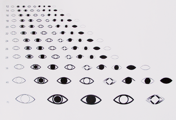
| Ojo font was created for this edition. |
|

|
|
|
|
|


D-FILE | © 2005-2018